Editorial Design · 2026

Issue 01: Human / Machine
An independent magazine exploring technology, design, digital culture, and the relationship between people and machines. Issue 01 asks how technology reshapes creativity, identity, work, and daily habits—without losing readability.
- Role
- Editorial Designer, Art Director, and Information Designer
- Tools
- InDesign · Photoshop · Illustrator · Figma

Issue 01
HUMAN
/ MACHINE
The New Creative Machine
Hardware · Interfaces · Connection
Spring 2026 · $18 USD
A publication system for complex editorial storytelling
Signal Magazine demonstrates how typography, grid, image direction, and information design can carry an entire issue—from cover to data feature—while staying flexible for departments.
Signal treats the page as a calibrated instrument—experimental enough for creative readers, disciplined enough for long-form thinking.
Jump to feature spreadsExperimental enough to feel alive, disciplined enough to read
The brief
Create a magazine that feels visually experimental for a creative audience while remaining readable across long articles, interviews, reviews, and data-heavy pages.
The constraint
The system must support multiple content types without making every spread look identical—and without sacrificing hierarchy when density rises.
Readers who want depth without academic distance
- Curious, not breathless
- Analytical without coldness
- Visually confident, verbally clear
- Editorial rather than corporate
A believable issue sequence with gravity in the middle
Front matter orients, the feature carries weight, departments vary rhythm, and the closing essay restores quiet.
| Pages | Title | Kind |
|---|---|---|
| 01 | Front Cover | Cover |
| 02–03 | Contents | Navigation |
| 04 | Editor’s Letter | Front matter |
| 05 | Contributors | Front matter |
| 06–09 | Opening Essay — Building a More Human Interface | Essay |
| 10–21 | Main Feature — The New Creative Machine | Feature |
| 22–27 | Interview — Designing With Intelligent Tools | Interview |
| 28–31 | Studio Profile — Inside the Independent Hardware Movement | Profile |
| 32–35 | Product Review — Five Tools Changing Small Studios | Review |
| 36–39 | Short News — Field Notes | News |
| 40–45 | Data Feature — How Creatives Use Technology | Data |
| 46–47 | Closing Essay — The Cost of Constant Connection | Essay |
| 48 | Back Cover | Cover |
A 12-column master that flexes without collapsing
Consistent outer margins and baseline rhythm allow full-bleed images, two-column articles, three-column information pages, side notes, and data blocks.
Toggle applies to the cover, feature spreads, and sample layouts below.
Full-width image
Two-column article
Three-column info
Narrow text + wide image
Three roles: display, editorial body, utility
Outfit for confident headlines, Source Serif 4 for long-form reading, JetBrains Mono for folios and metadata. Line length stays near 60–72 characters; body never drops below readable web sizes in this presentation.
Outfit / 92–120 pt / tracking −2% / weight 700
SIGNAL
Outfit / 42–56 pt / leading 0.95 / weight 600
The New Creative Machine
Source Serif 4 / 18–22 pt / leading 1.35
How studios renegotiate authorship with intelligent systems.
JetBrains Mono / 10–11 pt / uppercase tracking 0.16em
Words by Jordan Ellis
Source Serif 4 / 10.5–11.5 pt print · 18–20 px web / 22–26 pica measure / leading 1.45
The tools do not invent taste. They accelerate decisions already forming in the room—sometimes clarifying them, sometimes exposing their absence.
Outfit / 16–20 pt / weight 600
A quieter kind of automation
Outfit / 28–36 pt / leading 1.1 / accent rule
Speed without judgment is just noise with better packaging.
Source Sans 3 / 8–9 pt / warm gray
Fig. 03 — Prototype console, Portland studio, 2025.
JetBrains Mono / 8 pt / outer margin
Signal 01 · 14
Source Sans 3 / 9–10 pt / cobalt accent rule
Related: Interface ethics glossary
JetBrains Mono / 9–11 pt / tracking 0.14em
SPRING 2026 · $18 · ISSUE 01
Restrained palette, strong photography rules
Signal leads with type, layout, and imagery—supported by a confident orange/cobalt system. Color is editorial energy, not a neon interface. Image direction: high-contrast portraits, hardware close-ups, studio environments, screen light, hands with tools, saturated duotone.
High-contrast portrait
Close-up hardware
Studio environment
Three concepts, one shelf-ready final
Issue 01
HUMAN
/ MACHINE
The New Creative Machine
Hardware · Interfaces · Connection
Spring 2026 · $18 USD
Selected for newsstand recognition, theme clarity, and flexible cover-line hierarchy.
The final hybrid kept masthead authority, theme clarity at distance, and room for cover lines—winning the monochrome and thumbnail tests.
Issue 01
HUMAN
/ MACHINE
The New Creative Machine
Hardware · Interfaces · Connection
Spring 2026 · $18 USD
Issue 01
HUMAN
/ MACHINE
The New Creative Machine
Hardware · Interfaces · Connection
Spring 2026 · $18 USD
Hierarchy you can scan, pages you can find
Contents · Issue 01
The New Creative Machine
Six representative spreads with previous / next, thumbnails, keyboard arrows, optional grid overlay, and full-screen viewing—no slow page-flip gimmick.
Opening spread · p.10–11
Signal · Feature · 10–11
The New Creative Machine
How studios renegotiate authorship, craft, and pace when intelligent tools enter the room.
Distinct patterns inside one publication family
Field Notes
Tight modular cards, bold kicker, 90-word limit
01 · Briefing
02 · Dispatch
03 · Update
04 · Signal
Studio Profile
Portrait left, specs rail right, long caption under tools
Interview
Q in mono, A in serif, generous pause between exchanges
What should tools make visible?
Constraints, authorship, and consequence.
Opinion
Single column, oversized initial, restrained imagery
Tools Roundup
Numbered list, product stills, score chips
- 1Studio light9.0
- 2Input console8.0
- 3Proof display7.0
Closing Essay
Quiet margins, longer measure, minimal chrome
Attention returns slowly when the page leaves enough room for silence.
46—47Field Test: Lumen Desk Lamp Pro
Fictional product used to demonstrate review hierarchy. Specifications are sample layout values—not real product claims.
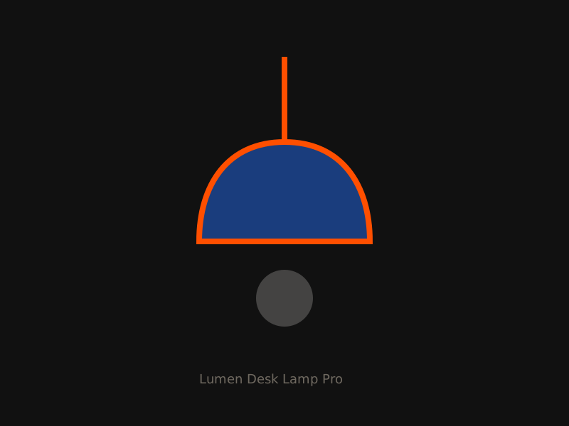 Product still
Lumen Desk Lamp Pro
Fictional review · Sample price $249
A focused task light that stays out of the way—until you need precise color temperature shifts for late proofing sessions.
“It behaves like a tool, not a gadget.”
- Stable clamp geometry
- Quiet brightness steps
- Readable physical controls
- App pairing feels optional
- Cable management is basic
| Color temp | 2700–6500K (sample) |
|---|---|
| CRI | 95+ (sample) |
| Power | USB-C / sample draw |
| Verdict | Recommended for small studios |
How creatives use technology
Data shown for editorial-design demonstration purposes. Figures are fictional sample data created for this case study.
Primary creative tools
AI tool frequency
- Weekly+48%
- Monthly27%
- Rarely18%
- Never7%
Screen time, environment, concern, valued traits
- <4 hrs12%
- 4–6 hrs28%
- 6–8 hrs36%
- 8+ hrs24%
- Home studio41%
- Coworking23%
- Office19%
- Hybrid / cafe17%
- High31%
- Moderate44%
- Low25%
- Reliability29%
- Speed21%
- Transparency26%
- Craft control24%
- Primary creative tools: Figma leads at 34%, followed by code editors at 22%.
- Average daily screen time clusters between six and eight hours (36%).
- Most respondents work from a home studio (41%).
- Automation concern is mostly moderate (44%), with 31% reporting high concern.
- Nearly half use AI tools weekly or more (48%).
- Reliability (29%) and transparency (26%) edge out speed as valued traits.
Object presence without heavy 3D assets
Hierarchy that reflows—not a shrunk print PDF
Signal · Feature · 12–13
Words by Jordan Ellis
Creative work has always depended on instruments. What changed is not the presence of tools, but the speed at which they propose options before a team has finished asking the question.
In rooms we visited for this issue, the most useful systems were not the loudest. They were the ones that made constraints visible—time, materials, audience, ethics—so people could decide with clearer eyes.
The new creative machine is less a replacement for authorship than a pressure test of taste. When generation becomes cheap, selection becomes the craft.
The New Creative Machine
The new creative machine is less a replacement for authorship than a pressure test of taste. When generation becomes cheap, selection becomes the craft.
What changes digitally
- Columns collapse to a single readable measure.
- Side notes become expandable callouts under paragraphs.
- Folios become progress and section labels.
- Images stack full-width with captions beneath—not beside.
Believable specs for press readiness
Specifications may vary by printer. These sample settings support a standard US letter editorial format.
8.5 × 11 inches (trim)
0.125 inch on all sides
0.25 inch inside trim for critical type
CMYK for print; RGB exports for digital edition
300 PPI at final size; convert profiles before soft-proof
Body, Deck, Caption, Pull Quote, Sidebar, Folio
Emphasis, Small Caps Meta, Link Accent, Score Chip
A-Feature, B-Departments, C-Data, D-Covers
Overset text, missing links, image resolution, ink limit
PDF/X-1a for press; interactive PDF + web article for digital
From brief to masters
- 01 · Process stage
Editorial brief
Define Human / Machine as a lens, not a gadget issue.
- 02 · Process stage
Audience definition
Designers and developers who want depth without academic density.
- 03 · Process stage
Content map
Sequence from orientation → feature gravity → departments → reflection.
- 04 · Process stage
Thumbnail sketches
Pencil studies established hierarchy, pacing, and image rhythm.
- 05 · Process stage
Grid tests
12-column master with flexible 2/3/4/6 combinations.
- 06 · Process stage
Type pairing
Outfit + Source Serif 4 + JetBrains Mono locked after readability tests.
- 07 · Process stage
Cover alternatives
Three directions refined; hybrid selected for shelf clarity.
- 08 · Process stage
Layout revisions
Dense spreads gained a sidebar escape hatch for breathing room.
- 09 · Process stage
Final system
Masters, styles, and department patterns documented for Issue 02.
What editorial hierarchy taught me
Hierarchy
I learned that hierarchy is not decoration—it is navigation for attention. When every element shouts, readers stop trusting the page.
Consistency and variation
Departments stay recognizable through recurring structures, while features earn more dramatic scale and image sequencing.
Why the grid mattered
The 12-column master let me change rhythm without inventing a new system every spread. Variation felt intentional instead of accidental.
Hardest challenge / next
Dense editorial with side notes was hardest—protecting measure while keeping the page alive. Before professional printing I would refine ink limits, commission real photography, and soft-proof the orange accent under CMYK conversion.