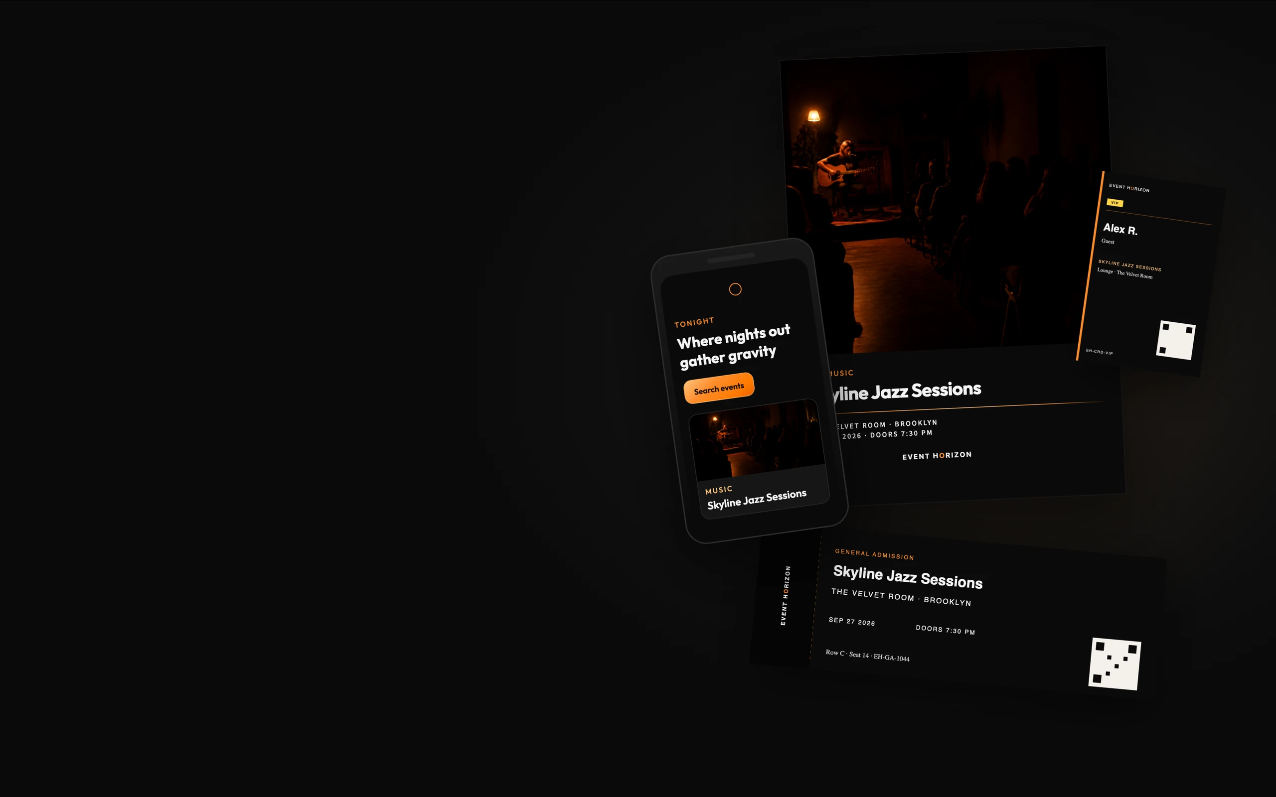
Brand Identity · 2026
Event Horizon
Brand identity for a cinematic event-discovery platform.
Where nights out gather gravity.
- Role
- Brand Identity / Graphic Design
- Scope
- Identity system, campaign, event collateral, merchandise
- Product
- Event discovery platform
- Year
- 2026
The product already existed
Event Horizon began as a working event-discovery product. The branding campaign did not invent a disconnected identity. It named what was already distinctive and turned those decisions into rules that could survive off the screen.
- Outfit as the display voice
- Void black and Horizon orange
- Warm contrast instead of cool tech gray
- Cinematic event photography
- A circular motif as the point of gravity

From product style to brand system
The interface had a recognizable atmosphere. It did not yet have complete rules for print, credentials, tickets, posters, signage, merchandise, or partner materials.
What makes something feel like Event Horizon when the website is not present?
That question drove every later decision: how large the mark can be, when it should disappear, and which motifs still read as the brand in a dark room.
Warm Darkness.
Black space. Controlled orange light. People and experiences pulled toward a center.
Gravity is a metaphor, not costume astronomy. The allowed language is a circular void, a horizon line, a cropped arc, an interrupted orbit, and amber light. Not planets, stars, galaxies, or astronauts. This is an event platform.
One gravitational center, two approved lockups
The identity supports two approved treatments. In the global wordmark, EVENT HORIZON uses a standard wordmark with the O in HORIZON colored Horizon orange. In merchandise lockups, the hollow orange ring appears as a separate symbol above or below the type. A single piece uses one treatment or the other—never both.
Dark field · orange O wordmark
Light field · same construction
Merchandise ring · hollow center
Stacked merch lockup
The merchandise ring stays hollow. It does not thicken into a badge, fill with orange, or grow elliptical rings. One gravitational center per piece.
Void, Horizon, Warm White
The system lives in black space with one gravitational accent. Nightlife purple is a category color, not identity. VIP gold is status-only.
Outfit carries energy. Source Sans 3 carries reading.
Hierarchy, not a specimen dump. Outfit is identity and event voice. Source Sans 3 keeps longer copy readable. Outfit Medium handles labels, metadata, and tickets.
Outfit Bold
Where nights out
gather gravity.
Source Sans 3
Body and explanatory copy. The product, this case study, and longer event descriptions stay in a readable sans so Outfit never has to do every job.
Outfit Medium · GA · Doors 7:30 PM
Skyline Jazz Sessions
The system is stronger than the logo
These motifs can build a recognizable Event Horizon layout without placing a giant wordmark in the center.
Horizon line
A thin orange rule. It divides, dates, and holds type in place.
Outlined ring
Hollow center. Never a filled disc, sunset, or Saturn.

Cropped arc
Apparel-scale gravity. The circle continues off the object.

Interrupted orbit
Motion implied by a break, not by planets.
Amber wash
Light pulled toward a center. Used in photography and dark fields, not as a second logo.
The brand doing its actual job
Tickets, credentials, and wayfinding had to work in the hand and in a dark venue. The mark stays small. Type, contrast, and the horizon line do the recognition.
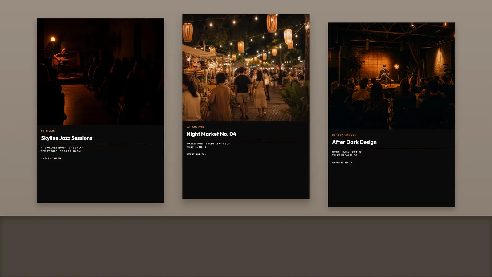
Photography changes. The system does not.
Skyline Jazz Sessions, Night Market No. 04, and After Dark Design Conference share type, spacing, a horizon line, and restrained orange light. That is what makes them a family.
Expressive for guests. Functional for crew.
The system moves off the screen into objects people carry, wear, and use. Consumer backs use the cropped arc and tagline. Staff apparel drops the graphic and says STAFF. Same identity, different jobs.
Each object is one application of the system. Apparel, drinkware, and print keep the same gravity without repeating the same lockup on every surface.
The same world, two surfaces
The system moves between two lockups without changing its center of gravity. Digital and editorial applications use the orange-O wordmark; symbol-led merchandise and compact physical applications use the hollow ring with plain type. Each object chooses one treatment—never both.
Where nights out gather gravity.
A brand is useful when it can adapt
Extending an existing product identity is different from designing from zero. Physical applications exposed spacing problems screens hid, and the system got stronger when the mark could recede.
Event Horizon taught me that a brand system becomes useful when it can adapt without losing recognition. The strongest applications were not the ones with the largest logo, but the ones that used the same type, contrast, rhythm, and visual gravity in ways appropriate to the object.