Brand Identity · 2026
VOLTLINE
A complete brand identity for a premium technology-accessories company—built around precision geometry, controlled energy, and systems that stay consistent from packaging to product launch ads.
Precision tools for high-performance work.
- Role
- Brand Designer, Art Director, and Visual Systems Designer
- Tools
- Adobe Illustrator · Photoshop · InDesign · Figma
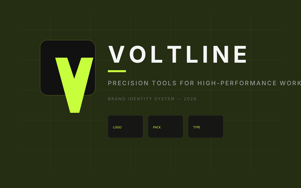
A premium accessories brand that earns trust through clarity
Voltline needed an identity that felt fast and technical without borrowing the visual language of arcade-ready gaming brands. The system had to scale from a tiny product icon to trade-show architecture while remaining readable, modular, and calm.
Precision tools for high-performance work.
Creator and professional technology accessories
Logo system, color, type, packaging family, and campaign kit
Communicate performance without becoming a gaming cliché
Most accessories brands either disappear into generic tech gray or overcorrect into neon spectacle. The brief was to design a system that feels energetic to enthusiasts while remaining credible for developers, designers, and remote professionals.
Constraints
- No animal mascots, flames, or lightning-bolt marks.
- Accent color reserved for interaction and product ID, not decoration.
- Logo must survive embroidery, packaging foil, and 16px favicons.
- Family packaging must share one structure with clear product variation.
Design opportunity
Precision can be emotional. Controlled forward angles, modular spacing, and quiet accent moments create a sense of speed without relying on aggressive gaming conventions. The identity uses alignment and negative space as the brand's primary energy.
Built for people who care how their tools feel
From keyword board to a selected geometric system
The process shows the decision path from keyword board to the selected geometric system, including the directions that were tested and rejected.

Aligned V / L system
The final mark keeps modular geometry, strong negative space, and a compact L counterweight that implies connection without literal circuitry.
Supporting language
Signal lines, cropped frames, and specification labels carry the brand even when the logo is absent.
Signal Flow
RejectedToo close to literal data-stream metaphors and felt like a SaaS dashboard brand.
Hardware Module
ExploredUseful for packaging grids, but the symbol became overly complex at small sizes.
Aligned V/L
SelectedA modular V form with a compact L counterweight communicates forward motion without a lightning cliché.
A geometric V/L mark with modular lockups
All logo assets live in /public/projects/voltline so future vector replacements can drop in without rewriting components.

Maintain clear space equal to the height of the L counterweight on all sides. Never crowd the mark with photography edges or UI chrome.
16px digital minimumIncorrect use
- Do not stretch or compress the wordmark.
- Do not place Electric Lime behind the full logotype on product faces.
- Do not add drop shadows, glows, or outline treatments to the mark.
- Do not rearrange the symbol and wordmark into unapproved lockups.
Carbon foundations with a single electric accent
Electric Lime is reserved for calls to action, active states, and product identifiers. The rest of the system stays graphite-led so the accent remains meaningful.
Geometric display with calm body clarity
Outfit carries the industrial display voice already used across this portfolio. Source Sans keeps long-form reading comfortable, while JetBrains Mono handles specifications and metadata.
VOLTLINE AXIS
Precision without spectacle
The type pairing favors clarity under dense product information. Display faces stay geometric and tightly spaced; body copy remains open enough for packaging panels and guidelines text.
SKU VL-AXIS-87 · REV 02
Explore the system
8000 Hz
Precision in every connection
Performance tools designed to support focused, everyday work.
VL-AXIS-87 · INPUT 5V · REV 02
A kit that works even when the logo is absent
Collateral that proves the system under real constraints
These are composed CSS/SVG mockup presentations with replaceable image slots for future photo-realistic assets.
One structure, three product identities
Axis, Pulse, and Core share hierarchy, grid logic, and technical panels. Accent bars and product names create family variation.
Axis Mechanical Keyboard
Low-latency typing for long sessions
VOLTLINE
Axis Mechanical Keyboard
Spec panel
- · Hot-swap
- · Gasket mount
- · USB-C
- · Aluminum top
Pulse Performance Mouse
Sensor clarity with quiet actuation
VOLTLINE
Pulse Performance Mouse
Spec panel
- · 26K DPI
- · 69 g
- · PTFE feet
- · 2.4 GHz / BT
Core USB-C Hub
Desk expansion without cable chaos
VOLTLINE
Core USB-C Hub
Spec panel
- · 8 ports
- · 100W PD
- · 4K HDMI
- · SD / microSD
A compact standards document, page by page
Brand introduction
Defines Voltline’s purpose, positioning, and controlled-energy principle so every expression begins from the same strategic idea.
Rule sample block
What this identity taught me
Strongest decision
Reserving Electric Lime for functional moments. Once the accent stopped decorating every surface, the brand immediately felt more premium and more intentional.
Challenge
Designing energy without gaming clichés. Forward motion had to come from alignment, spacing, and modular geometry instead of lightning metaphors or RGB excess.
What I learned
A complete identity is a system of relationships. The logo only works if packaging, type, and campaign layouts can carry the same logic when the mark is small—or missing entirely.
Future revision
I would refine the interim artwork into final composed mockups, photograph real print pieces, and expand the guidelines into a shareable PDF with production-ready spacing diagrams.
Layouts that adapt by ratio, not by crop
Build with quieter power.
Desk tools that stay out of the way.
Precision accessories for serious work.
Axis is ready.
Hot-swap. Gasket mount. USB-C.
Axis · Pulse · Core